
Post by Evan Liebgott, Research Assistant at the UNC EFC
Big picture: the “why” of dashboards
The Environmental Finance Center at the University of North Carolina (UNC EFC) has been creating water and wastewater rates sustainability dashboards for over 15 years, starting in North Carolina and expanding to over 20 states. But why has the UNC EFC invested so much time and effort into this product? What makes dashboards a useful tool?
Ultimately, dashboards serve as a resource for informed decision-making about water and wastewater rates. They are a visual tool for understanding rates in context. Utilities can understand not just whether their rates are higher or lower than some other utilities, but also how their rates compare to similar utilities. For example, small systems should be compared to other small systems.
Additionally, dashboards have the benefits of interactivity and accessibility. Users can choose any utility displayed, then adjust the consumption slider to see how bills at various consumption points compare to those in the selected comparison group. From the comparison group dropdown, users may select what utilities they are interested in comparing the selected utility to such as similar size, similar revenue generation, or similar customer income, among others. Finally, the rate increase slider shows estimates of how the metrics on the dials may change given a certain rate increase. Dashboards are accessible because they display publicly available data in a user-friendly way, rather than requiring users to request and then enter data. Information boxes that provide a brief explanation of what the dials mean and how they are calculated make the dashboard data digestible for the layperson and are a tool for communicating the financial sustainability of a utility to decision-makers and the public.
How do utilities use dashboards in the process of evaluating rates?
UNC EFC has gathered feedback from utilities and related decision-makers about how they utilize the dashboards including:
- Having a visualization representation of the data makes it easier to understand.
- The operating ratio dial helps explain to both board members and the public why a rate increase is a necessity. Furthermore, historical operating ratio data can show how well a utility has done to consistently meet this financial benchmark.
- It is difficult to know what the appropriate rate and financial benchmarks for a utility are. The dashboards resolve this issue by providing standards and suggestions related to financial sustainability.
- The comparison groups allow a utility to understand its benchmarks in relation to various classes of utilities.
- The rate increase slider provides a visual estimate of the effects of a rate increase. This is not a substitute for a complete rate study but can help justify the need for one.
- The affordability dial allows utilities to be mindful of the financial impact of rates and rate increases on a typical customer.
Extending dashboards
UNC EFC also offers tools which supplement the dashboards, such as the affordability tool and lead maps. The dashboard includes percent of median household income (MHI) that water bills account for, but there are other important metrics to consider when evaluating the affordability of rates: percent of households below the poverty line, unemployment rate, percent of households on social security, and percent of households on other safety net programs such as supplemental security and SNAP. The affordability tool incorporates these metrics.
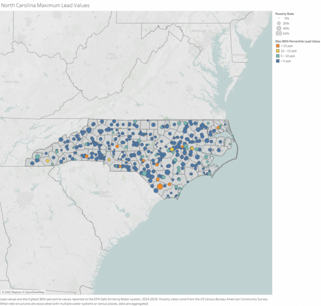
UNC EFC has also created lead maps for various states, which show the maximum lead values reported to the EPA Safe Drinking Water Information System (SDWIS) and poverty rates from the American Community Survey for each utility. The lead maps are visual examples of how census data can be integrated with other data relevant for utilities.
Conclusion
In sum, the rates dashboards are interactive and accessible representations of contextualized rates and financial data. Their purpose is to help decision-makers make the most informed decisions in the process of evaluating rates. Various supplemental tools and resources also use dashboard data, which further aids utilities.
Need technical assistance? The Environmental Finance Center is here to help!
The Environmental Finance Center at UNC-CH offers free one-on-one technical assistance for small water systems. If you have an interest in our support, contact emkirk@sog.unc.edu.
Visit https://efc.sog.unc.edu/resource/technical-assistance-for-small-systems/ to read more about technical assistance.
One Response to “Why Are Dashboards an Effective Medium for Communicating Rates Data and How Do Decision-Makers Use Them?”
Lance Smith
I am the finance director for Fort Collins, Colorado. I’m curious why there is no rates dashboard for Colorado online. Could you tell me a little about the challenges you have had with Colorado? I thought we were working well with your organization a few years ago at least.
Thanks