
Recent EFC tools have a new look and feel. Historically, the Environmental Finance Center at the University of North Carolina (EFC) built spreadsheet tools. EFC tools are designed to help utilities organize and analyze financial data to make sustainable decisions. Advances in technology are opening up new opportunities for sharing and explaining data. Tableau and other software packages like Power BI and Qlik provide powerful tools to help visualize data through charts and images. The EFC has found success using Tableau to provide updated tools that are attractive and easy to use for water and wastewater professionals.
In 2021, the EFC developed North Carolina Rate Sheets using Tableau. Project director Omid Barr offered this recent blog post describing development of the Affordability Tool in Tableau. The purpose of this blog post is to describe the broad data structures used within EFC tools. Those steps can be adapted to projects within utilities.
The art in communicating with data is translating data stored in a database into a tool or a visualization. Visualizations can be built with spreadsheets. Visualizations can also be connected to databases. Most utilities have data spreads across more than one database. Connecting a visualization to existing databases allows utilities to add value from data that is already being collected. Utilities can use visualizations to make decisions and to communicate with customers.
The data layer.
Much of the data utilities gather and rely on are stored in databases. Figure 1 was used in a previous blog post and offers a helpful structure for explaining what databases do.
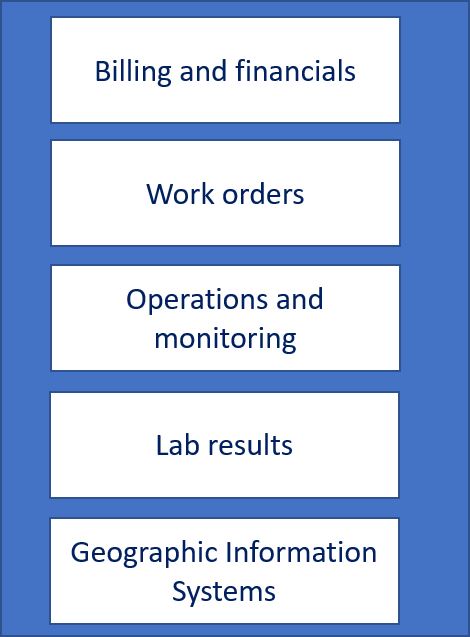
The examples of enterprise data systems in Figure 1 have highly structured data. Most applications gather data and put it into a database. A database is essentially a collection of tables. The tables are organized in a specific way and relate to each other. Database users can ask questions of the data. A question written in structured query language (SQL) can be saved and run several times using the same database.
Most of the systems described in Figure 1 would change over time as records are added to or removed from the underlying databases. A query run at any point in time reflects the data in the database at that time.
The visualization.
A well-designed picture is worth a thousand words. The EFC blog, “If you build the data platform, will they come?” outlines three central questions for project design. Staff who are building visualizations need to identify their goals and then pull data together. To pull data together, staff must understand how utility operations are represented in the database. With clear goals identified, a designer should translate data with the audience in mind.
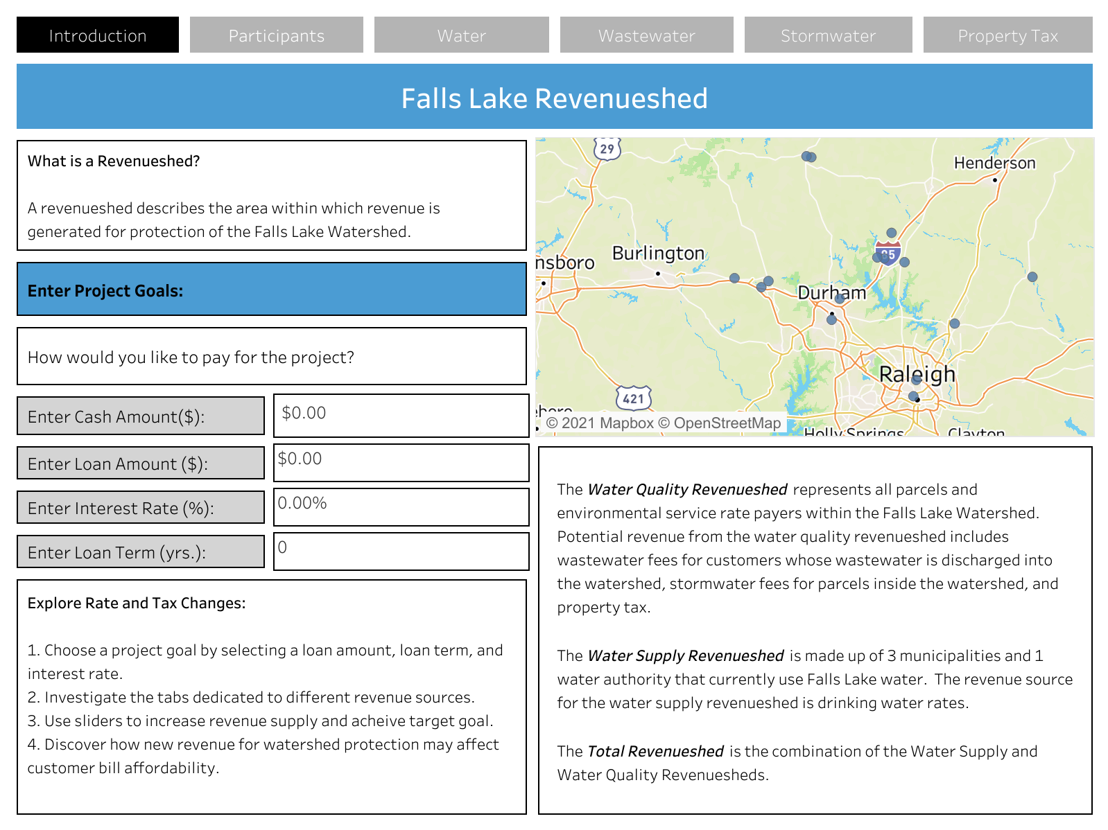
The Falls Lake Revenueshed, shown in Figure 2, is a good example of user-friendly data visualization. This tool consolidates data on revenue sources within the Falls Lake watershed and lets the user explore multiple options to pay for watershed protection projects, and to see how those options impact rates.
Why choose Tableau or a similar tool?
Tableau and other data visualization software are a tremendous help in organizing large collections of data. These programs aggregate data from large data sets and generate intricate and engaging graphs. Graphs show patterns within the data, making it easier for users to understand and make decisions from that data. Data visualization software displays charts, maps, and images all within a single frame.
Data visualization software helps designers make meaning from data and helps make visualizations easy to use. Data connections and calculations are built directly into a data visualization. Designers can provide simple selection options directly into a document and embed that document into a website for broad access.
Putting it all together.
Visualizations should present a clear message and are a great tool for utilities to use in communicating with different groups. Gathering, connecting, and organizing data allows the visualization designer to focus on a specific message. Connecting visualizations to a database is a helpful way to transform collected data into a format that is easier to analyze and communicate. Explore our newly upgraded EFC tools and consider how data visualization software can help you better explain data.