By Emma Grace Copenhaver, Project Analyst at the UNC Environmental Finance Center
Dashboards
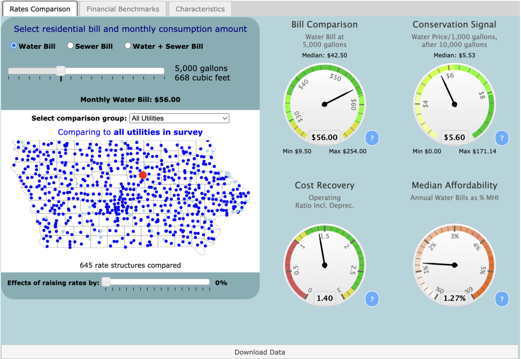
Since 2005, the EFC has been creating dashboards that compare utility rates across a state. These dashboards are helpful tools for utility decision-makers as they consider their financial health, financial policies, and rate changes. Dashboards can help utilities contextualize their rates meaningfully by using several financial and demographic metrics to uncover the story behind one utility’s rate structure. Each metric and function allow utility decision-makers to think about their rates beyond just numbers. The EFC has created dashboards for many states nationwide but has most recently completed the first year of the Iowa Water and Wastewater Rates Dashboard and the Iowa Stormwater Dashboard.
- Choose their utility from a list of participating utilities.
- Determine whether they would like to see water rates, sewer rates, or both.
- Adjust the consumption allowance and select their comparison group.
- A similar number of accounts.
- Similar revenue generation.
- Similar customer income (based on MHI of the Census-Designated Place).
- The same water source type.
- The same wastewater treatment type.
- The same ownership types.
- A similar rate structure.
- Within a certain radius of the chosen utility.
Comparison groups
The comparison feature is a great way to benchmark one utility against its peers, but it does not capture and reflect a utility’s unique challenges and history. Comparison groups are another layer on the dashboard that invites users to be curious about their utility and should supplement data analysis rather than act as a definitive result. Once the user chooses their inputs and comparison groups, the dials on the right will automatically adjust to show four key indicators about the utility’s rates and financial health. These dials include information on:
- Bills at the Given Consumption Point.
- Conservation Signal.
- Operating Ratio (including depreciation).
- Median Affordability (based on MHI).
The Bill Comparison and Conservation Signal dials use utility rates to compare prices across the state, which means they will change based on the selected comparison group. The Operating Ratio dial uses the financial information provided by the utility to visualize the chosen utility’s financial condition. The Median Affordability dial uses this information as well as census data to visualize the affordability of their rates in their community. The dials automatically adjust based on changes to the comparison group and other inputs, allowing users to benchmark their utility against similar utilities across the state. The dials highlight the chosen utility, which enables the user to think more deeply about their rates and financial information.
Users also have the option to switch tabs on the top to reveal additional financial metrics and census characteristics about the utility that can help them contextualize its current financial state and rate structure.
Iowa Stormwater Dashboard
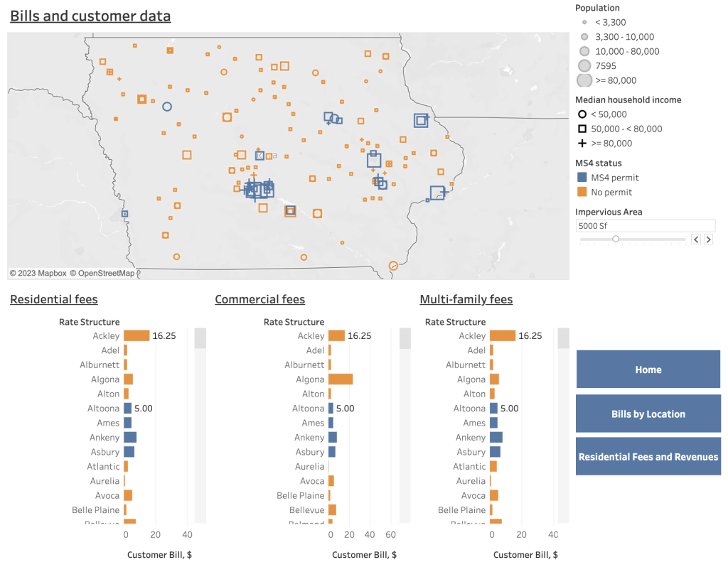
In addition to the Water and Wastewater Rates Dashboard, Iowa is the third statewide Stormwater Dashboard produced by the UNC EFC. The Iowa Stormwater Dashboard had a response rate of 72% across 177 stormwater utilities in the state. Like the Water and Wastewater Dashboard, the Stormwater Dashboard allows users to access rate information on their utility and compare these rates to other utilities across the state. Users can compare rates based on customer class, rate structure type, impervious surface area, and location. The dashboard also has filters to show customer MHI, population, and MS4 permit status of all utilities, which gives users even more control to customize their inputs. The dashboard also has helpful definitions that help users choose the right inputs and visuals for their utility.The Iowa Water and Wastewater Dashboard and the Iowa Stormwater Dashboard are helpful tools that utilities across the state can use to gain insight into their financials and rate information. Users can use the dashboards to examine their utility’s current financial condition or consider additional options for revenue generation. Dashboards are an effective way to keep a pulse on a utility’s financial status. These metrics can be used with additional information, such as yearly audits, to dive deeper into a utility’s financial health and rate structure. They are an excellent way to learn about utility rates and think deeply about your utility.For more statewide rate information, you can access the Iowa Water, Wastewater, and Stormwater Report or access the Water and Wastewater and Stormwater dashboards directly.
Need technical assistance? The UNC Environmental Finance Center is here to help!
The Environmental Finance Center at UNC-CH offers free one-on-one technical assistance for small water systems. If you have an interest in our support, fill out our interest form here or contact efc@sog.unc.edu.
Visit https://efc.sog.unc.edu/technical-assistance/ to read more about technical assistance.